Discover the Incognia brand


Incognia brand guidelines

Our mission is to empower safe digital experiences by combining unparalleled security, privacy and convenience.

Brand Positioning

Incognia is the innovator of next-generation identity solutions that enable secure and seamless digital experiences. With its persistent device fingerprint solution, Incognia combines best-in-class device recognition signals, location analysis and tamper detection for frictionless user verification and fraud prevention. Incognia’s customizable risk assessment and actionable insights empower companies in food delivery, ride-hailing, marketplace, and financial services to protect their reputation, retention and revenue. For more information, visit Incognia.com.

Brand Pillars

  • User experience: authentication doesn’t have to mean friction

  • Fraud prevention: location is the missing risk signal

  • User privacy: legitimate users will opt-in


user-experience-brandbook

Tagline

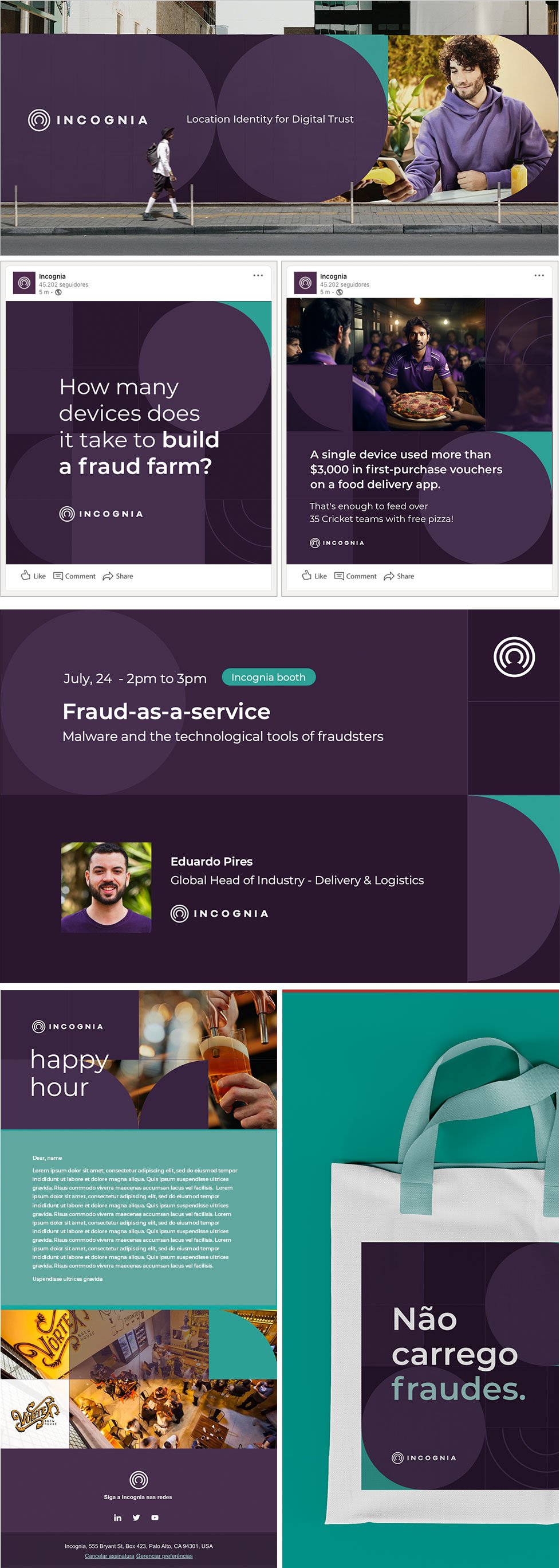
Location Identity for Digital Trust

Brand Attributes

The attributes represent how others perceive the brand.

brand-attributes-brandbook

Transparent

Incognia is open and honest with our customers and end users. We do not want to get between you and your users.

Innovative

Identity and account security are not new, behavioral identity for account security is revolutionary.

Approachable

Incognia as a brand is secure and intelligent, but also approachable in its tone. It aims to simplify security so users can take control.

Trustworthy

Incognia is a brand trusted to protect user privacy and provide account security.

Voice

Voice is the personality and emotion used in the company’s communications.

We speak like experienced professionals.

We are professionals

When we talk about privacy and security, we do not take it lightly, jokingly, or for granted.

We are informative

We are experts and have a deep understanding of location, privacy, security, identity, and authentication, and are able to communicate that plainly and clearly to all buyer personas.

We are innovators

We are engineering driven and we are always looking to the future, this is present in our solutions and our communication. But we are not robotics, we are conversational and professional.

Tone

Privacy, security, and authentication are serious topics so we lean more toward being formal while using plain language, graphics, and diagrams to get our point across understandably.

Terms

We use terms like:

  • Private Location Identity

  • Location-based digital identity

  • Location behavior

  • Device integrity

  • Device intelligence

Communications

We write things like:

  • Dear <name>, not, Hey <name>,

  • We aren’t big users of “!!!!!”

  • We don’t communicate in ALL CAPS

  • We use words, not emojis

  • Our humor is smart, we don't make jokes. 

Colors

Incognia's main color palette consists of four colors, two shades of green and two shades of purple.

The main attributes of the brand are reinforced by the colors. While purple is innovative and trustful, green contrasts it with transparent and approachable. They are desaturated but rich, elegant tones that work well separately as well as combined together.

The secondary palette is made up of 3 more colors, which must be only used when extra color application is needed to signal positive or negative responses. Green means positive situation, blue neutral and pink negative.

Primary Palette

colors-brandbook

Secondary Palette

secondary-colors-brandbook

Color for fabrics / t-shirts / clothes

Incognia Color for fabrics

Typographic

Montserrat is brand’s only typeface. It’s a classic, readable sans serif font that works well both for headline displays as well as small body text.

Monterrat is available in many weights, but Incognia uses only Regular, Medium, and Semibold to ensure clear type treatment without too many text styles.


Montserrat Showcase

Typeface System

Incognia’s typeface system is based on classic and serious headline - subheadline - body text relation. Following example displays correct ratio between those elements, with addition of action button, to help you understand how the brand’s composition should work.

Typeface system should always be kept readable and consistent with basic rules of readability.


Typeface System

Icons Style

Iconography for Incognia brand is based on simple, outlined form, to match the overall look&feel of a logo. It should be as simple as it gets, but not simpler. Icons, similar to the logo, should be presented in one solid color, to enhance readability and simplicity.


Icons_2

Elements

Incognia's visual elements are powerful tools to communicate our essence and values, creating identity and differentiation in our market. Consistency in visual elements causes rapid recognition and connection with the audience.

All elements of the Incognia brand are built from circular shapes, as well as the logo, creating a visual connection between both. The simplicity and iconic nature of the circles make them highly memorable, aiding brand recognition and recall, and reinforce the solution's frictionless use concept.

Texture

The texture, exclusively developed for the brand, is modular and built on a grid divided into exact squares. Like the incognia solution that combines different signals and parameters to compose its risk assessment, different pieces create the texture.

This composition can be designed and adapted in the most different ways necessary, but always from the combination of the same shapes and keeping the square proportion

Texture elements
Each texture element represents an evidence/reason from Incognia's risk assessment engine.

Textures Elements


Texture

Texture Animation

Map

Location is the essence of Incognia's technology, because of this, illustrations of maps and locations are fundamental to represent the brand's differential. To make these illustrations unique brand elements, an exclusive Incognia map pattern was designed following the same parameters as the official texture.


Incognia Map Texture

Dividers and shapes for text

Rectangles with rounded corners can be used as boxes and strips for dividing materials and supporting text.

Stripes should always have only one rounded corner and two sides bleed out of the designs. The rounded corner must be large and if used together with the texture or map, it must be equivalent to a grid square.

The rectangles that appear complete in the materials must always have the four corners rounded and small.


Incognia dividers and shapes

Dividers and shapes misuses

See some of the mistakes you can make while working with dividers and shapes, to help you understand the boundaries of its usage.


Dividers and Shapes Brandbook

Button System

Incognia's button system reflects the shape elements used in the brand and the main types are defined in this guide.

Incognia's Buttons System

Examples of using elements

Shape Examples

Photography

Photographic resources are a fundamental part of the Incognia brand, as they bring emotion, reinforce the brand identity and capture attention. In addition, they are an important tool to make tangible the benefits of the product and the impact generated on consumers.

All photos used must be aligned with the look and positioning of the Incognia brand. In other words, in addition to being visually coherent with the brand using its colors and style, the photos must communicate the same attributes as the brand: innovative, trustworthy and approachable.

User’s photos

Incognia technology is present on the devices of more than 200 million users globally, so these users are part of different ethnicities, ages, cultures, gender identities, lifestyles and all other pluralities. The photographs used in the brand must represent this diversity and show the positive impact of frictionless usability in people's daily lives.

brandbook-logo-21


We avoid

brandbook-logo-22

Negative situations, fraudsters or developers

Although most of the materials and photos present images of users benefiting from Incognia's solutions, in some cases representations of fraudsters, developers or users in bad situations are required. At these times, non-stereotyped images should be prioritized.

brandbook-logo-23


We avoid

brandbook-logo-24

Places, technology and devices

Incognia's solutions do not generate friction for users and move towards building a better world where technology will be at the service of people. Therefore, the images that represent the technology must be minimalist and always be in optimistic and safe places. In addition, trusted locations must be prioritized, that is, environments that users use on a daily basis.

brandbook-logo-25


We avoid

brandbook-logo-26

Illustrations

Illustrations are used in the Incognia brand when it is necessary to demonstrate complex concepts or make solutions and products tangible.

These graphic representations should always be informative, elegant and never childish or comical.

Product illustrations

They should always be in 3d style, but with simplified detailing and reduced colors.

brandbook-logo-27


We avoid

brandbook-logo-28

Technical illustrations

Must be in 2D style, minimalist and only in Incognia colors

brandbook-logo-29


We avoid

brandbook-logo-30

Videos

Illustrated videos

Product videos, solutions, use cases or any other objective that needs to represent non-tangible concepts can be produced with illustrations, videos in this format must follow the same directions as 3D illustrations.

Real pictures videos

The corporate videos are produced with a mixture of real images and graphics. In this case, the graphics are minimalist 2D and the guidelines for choosing images must follow the same rules that are used for choosing photos.

Webinars and live streams

For the recording of live streams and webinars, it is important to pay attention to the best practices presented below.

Best practices

  • Use an appropriate background

    Choose a quiet, well-lit, and organized location for recording.

    If necessary, use a blurred effect on your background or an Incognia institutional wallpaper. It is important in this case that all participants use the same resource.
  • Keep a professional appearance

    If possible, wear an Incognia T-shirt or one-piece in neutral or branded colors. Pay attention to your screen presence, including body language, facial expressions and video framing.
  • Test your equipment

    Test your equipment: Ensure that your audio, video, and internet connection are working properly before going live.
  • Use professional visuals

    Prepare relevant visuals or materials in advance, your slides will be prominent throughout the video, so they must be aligned with the Incognia brand.

Video Assets

Some visuals must be constant across all branded videos.

Logo animation

Animation of the incognia logo should always happen the same way.

logo-animation


Donwload the logo animation


Sound track

The soundtracks chosen for Incognia's videos must reflect the pillars and attributes of the brand. Music selections must sound bold and technological while also fitting into the emotional context of the video.

Below are some examples:

Neutral / Tech sound track
Dramatic / Emotional sound track
Inspiring / Happy sound track

Voice over

The voice for Incognia videos must be clear and convey knowledge. At the same time communicate dynamically and powerfully.

Below are some examples:

English
Portuguese

Lower thirds

People must be identified in videos always in the following format.

brandbook-logo-34

Advertising

The importance of consistent design in digital advertising lies in its ability to establish brand recognition, ultimately leading to higher engagement and better conversion rates.

That's why Incognia ads use a pre-established pattern for their creation. From a grid of 16 units that must be distributed between the text area and images, all layouts can be developed. The positioning of these elements can vary, but always respecting the proportions of the grid. Texts should also, whenever possible, use the standard size shown below:

ads-brandbook_1

Gif 6 (1)ads-brandbook_2

Social Media

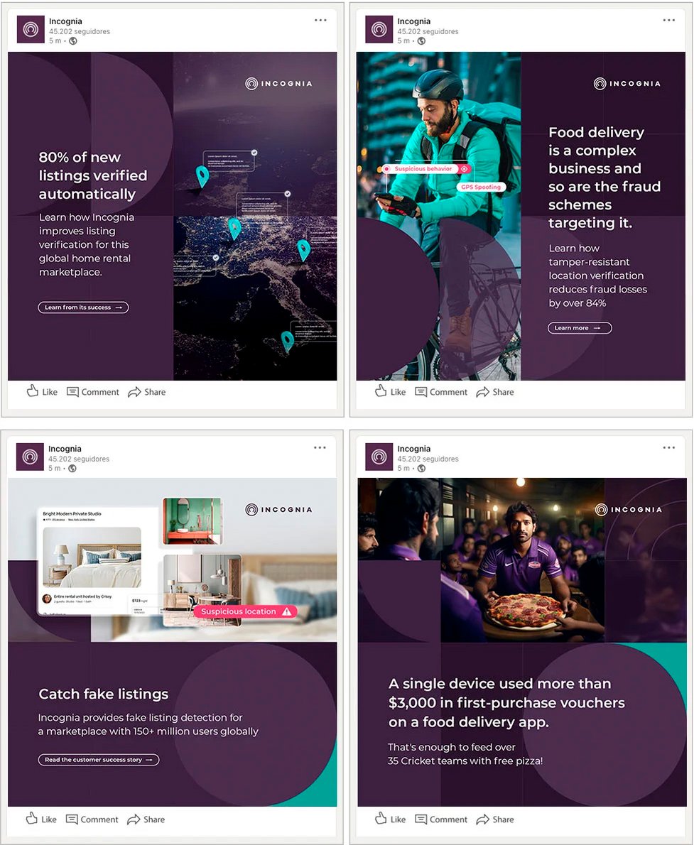
Visual consistency is crucial in social media as it helps establish a cohesive and recognizable brand identity, fosters trust and engagement among followers. That's why all posts must have the look of the brand.

In social networks, Incognia's positioning is informative, serious, but not old-fashioned or too technical. The tone of voice chapter of this guide explains more about this.

Linkedin, Twitter and Youtube are the company's official social networks and for posts with visual resources, square formats are always prioritized, as they fit on mobile and desktop devices.


Social media brandbook